ROLE
UX DESIGNER
PLATFORM
MOBILE APPLICATION
PURPOSE
GOOGLE UX CERTIFICATE
DURATION
APRIL 2022 - JUNE 2022
OVERVIEW
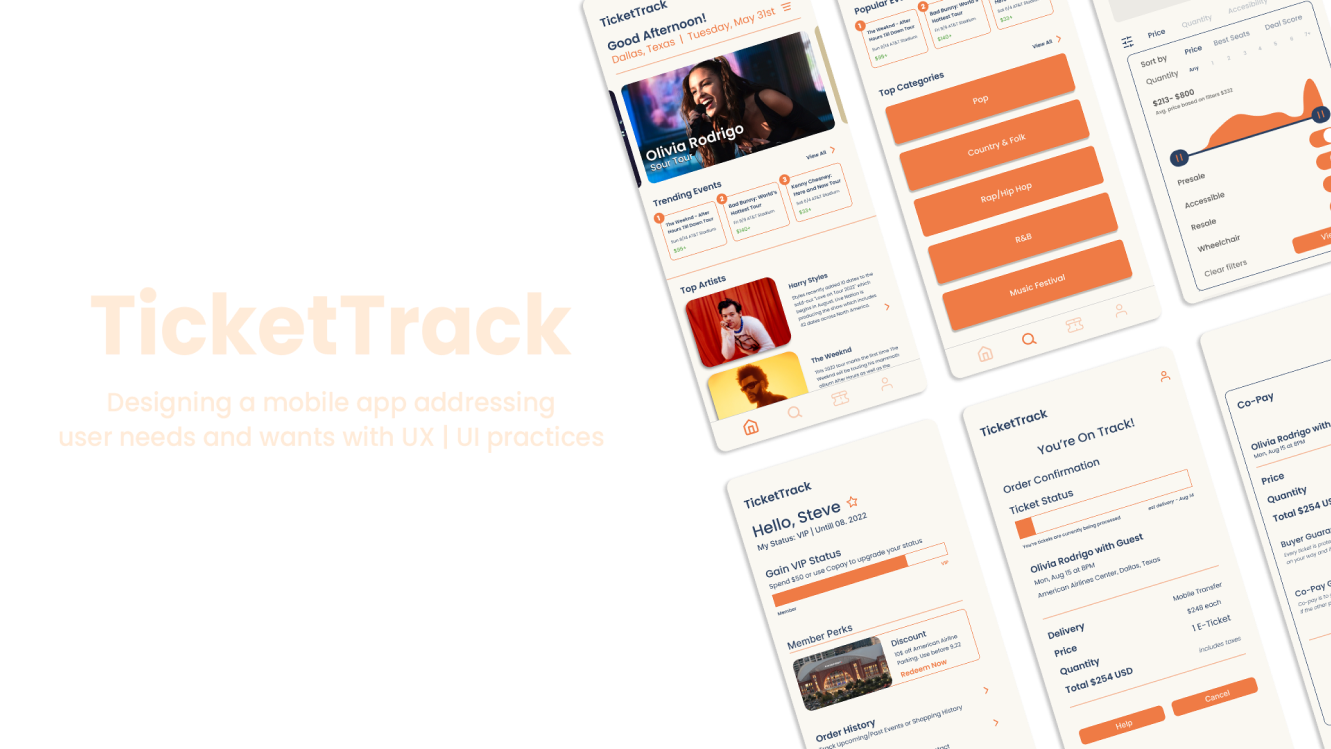
The objective is to design an app that allows users to entrust their tickets are secure, reliable and affordable with a seamless, customizable and accessible experience. This case study is broken up into:
user - wireframe - low-fidelity prototype - mockup - refine - demo - takeaways
USERS
Customers were hesitant to buy tickets due to past experiences: lost tickets, fake tickets, and lack of transparency. From conducting interviews and compiling the information into personas and journey maps, these pain points were present within mobile ticketing apps.
Price
Resale tickets is a big problem within the ticket marketplace. This leads to price increase and the only option to getting a ticket last minute.
Information Architecture
The process of finding a seat let alone the event, users were having trouble finding the event or looking for a seat due to the structure and confusing brought by the process.
Trust
Customers do not trust other websites that sell tickets due to fakes or price increases. Leading to customers having to spend more than usual.
WIREFRAMES
With a competitve audit I found the best things the competition were doing and implemented into these paper wireframes. While also improving upon the features that best fit the needs of the users.
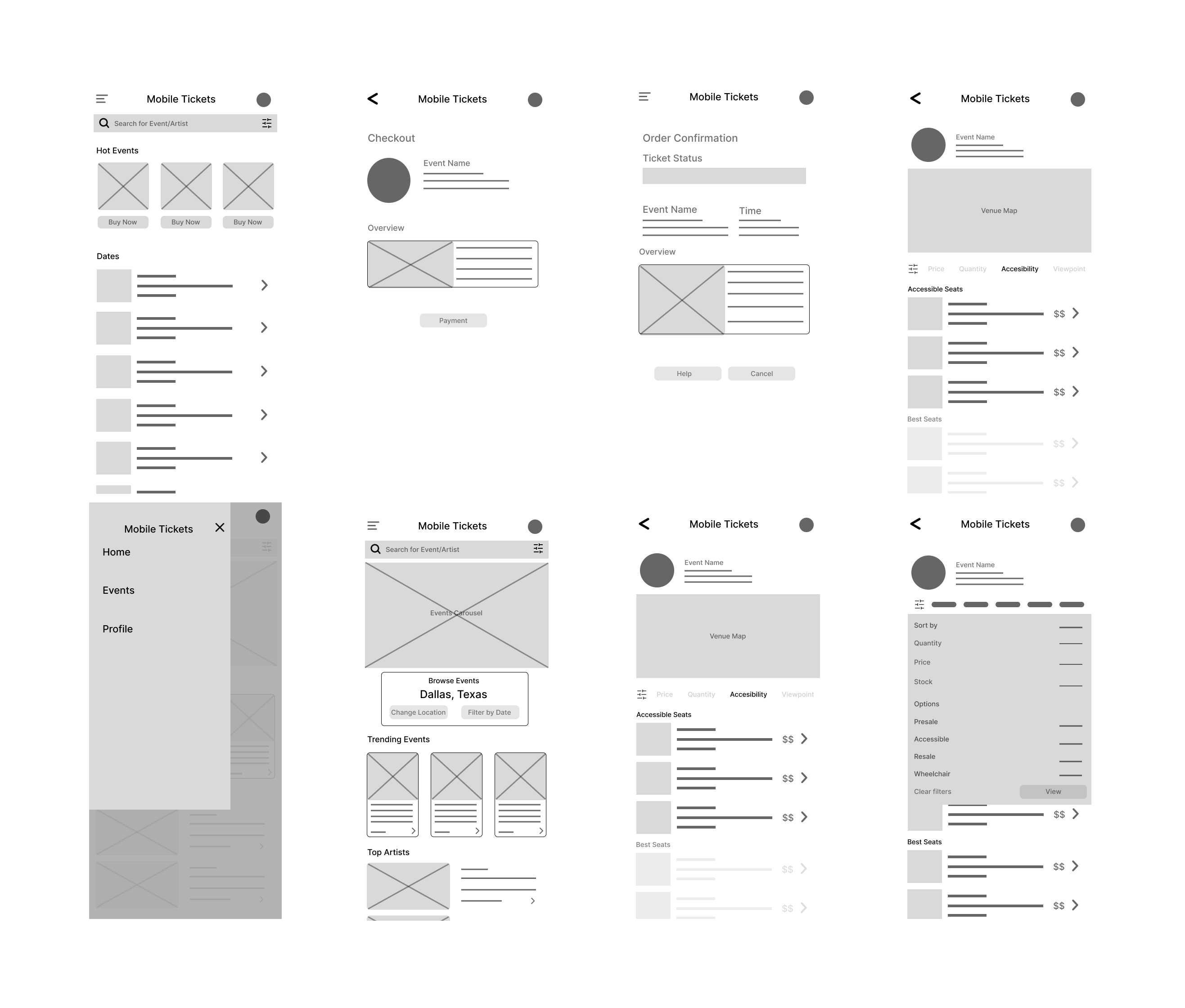
From here I turned it into a prototype and linked the pages together creating a user flow. Which consisted of users going through the steps of looking for an event to buy tickets to.
LOW-FI PROTOTYPE

With the prototype I conducted a usability study and gained user feedback on how they would navigate through the app. I gained insights to what can be changed with the prototype then which can be implemented into the mockups. Some pain points were the navigation was too disruptive and the layout of the content should be more spaced out so it can be more readable.
Here are the three insights I uncovered and will be focusing on:
Customization
Adding more customization options to the process such as location, tickets and account creation
Filters
Showcase the filters more prominently and making the process more seamless rather than disruptive.
Checkout
Making the checkout process more conversational rather than just clicking the next page and add engaging content.
With these insights, it is now to implement them into the mockups and bring in some color.
MOCKUP
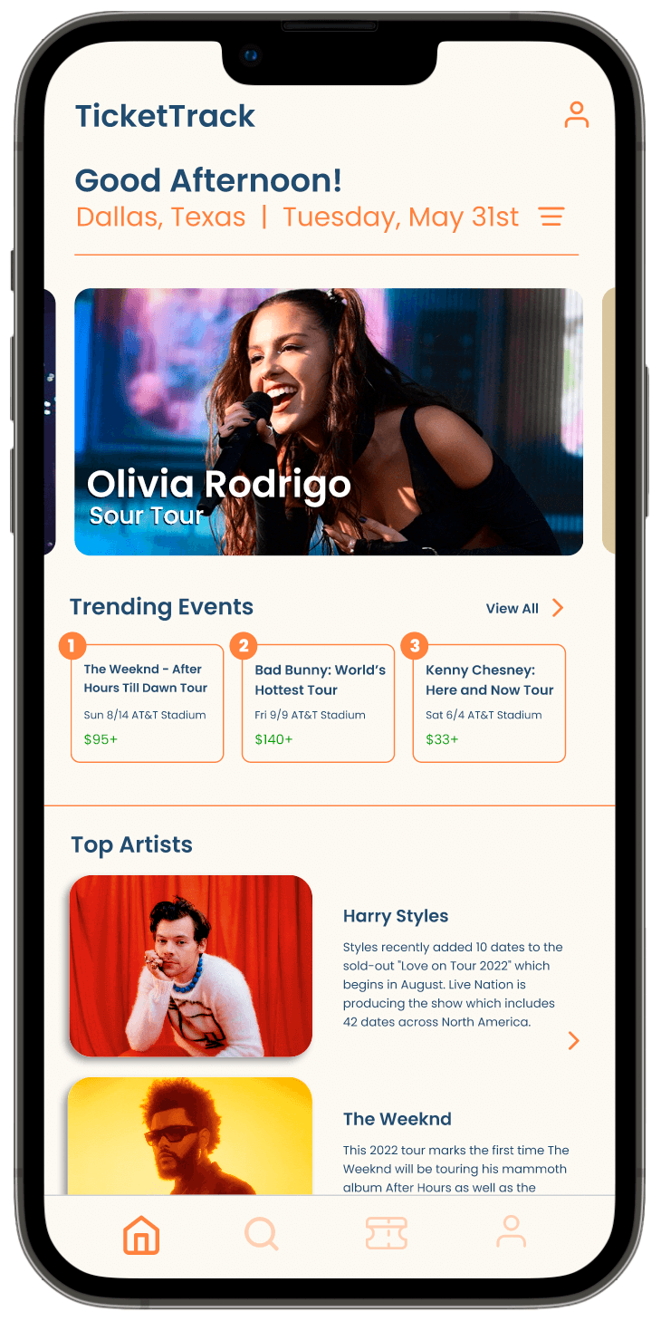
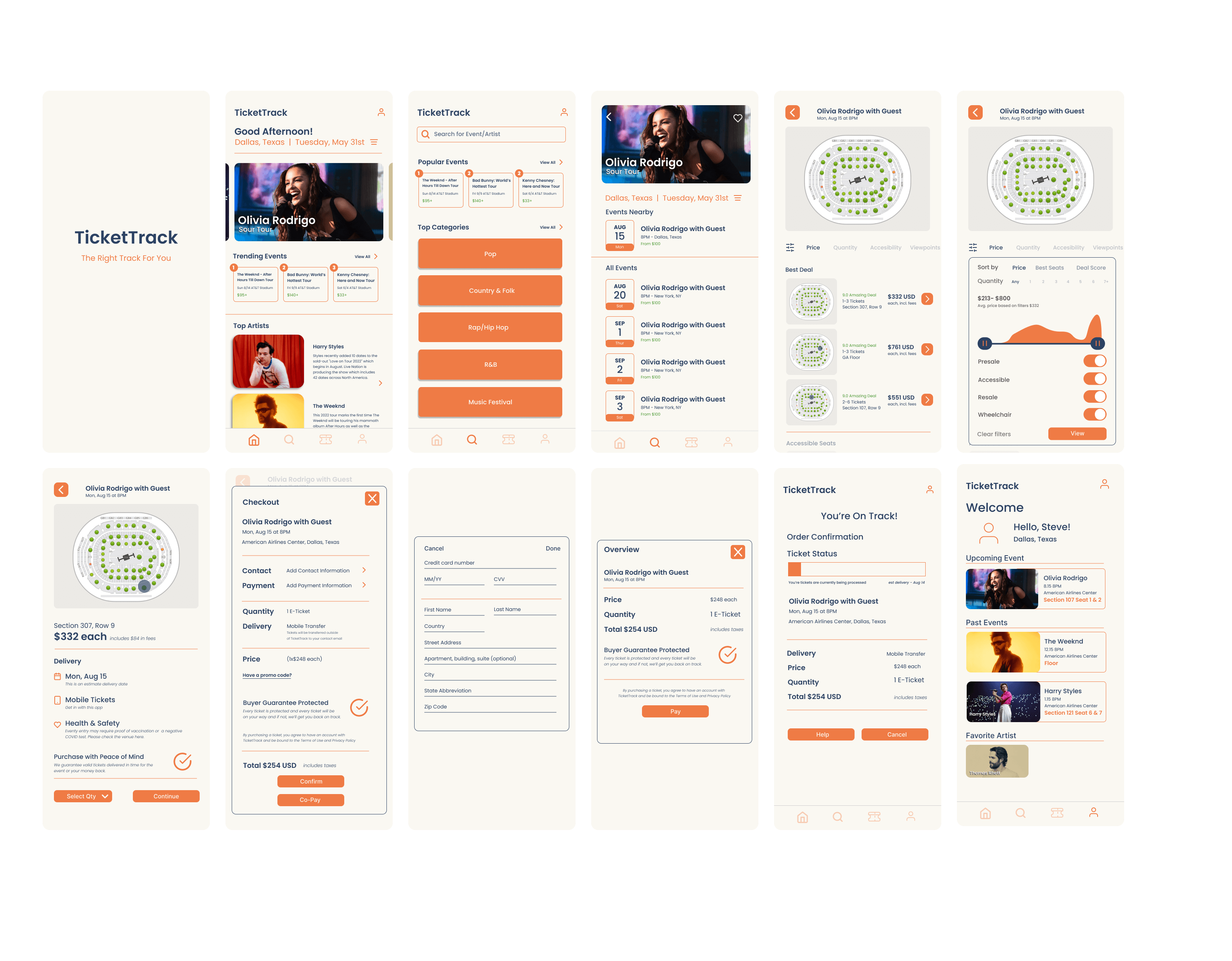
Prominent changes from the wireframes to the mockups was the navigation. With the changes the user can easily navigate from page to page. They also have all the information they need easily accesible.
The study showed that people wanted more filtering options and that it would be nice if the filtering does not block the venue map. So, I kept the navigation at the top and then made the screen smaller so you can still see the map at the top.
The checkout process to be more clear in what step of the process the user is in. Another feature is also added that allows for co-pay between users that are going to the event together. I will elaborate on the Co-pay feature in a second.
The order status of the tickets is a solution to users troubles with tickets being lost or not being delivered on time. This gives the user a visual on where and when they will get their tickets
REFINE
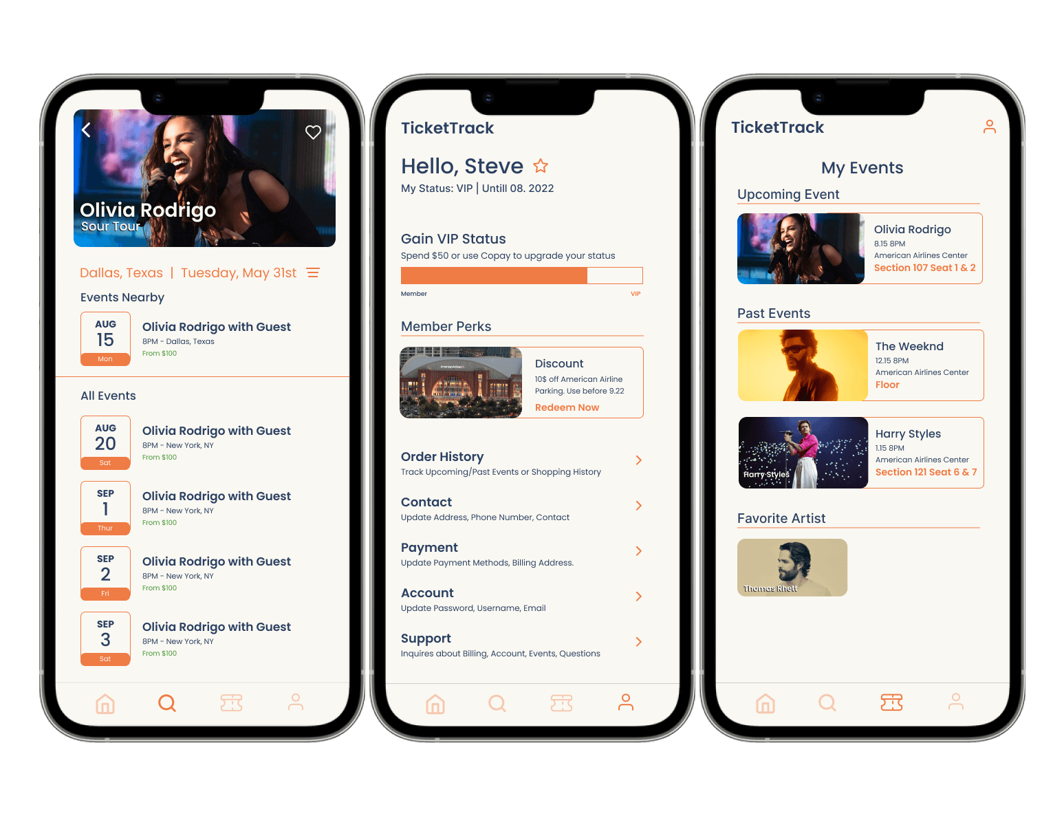
Customization - From the mockups I modified the account page to include redirects to what users may need. I also included a membership counter at the top and rewards at the bottom. This allows for more users to the app and an incentitive for them to use the app. They can also favorite artists which will show up on their account.
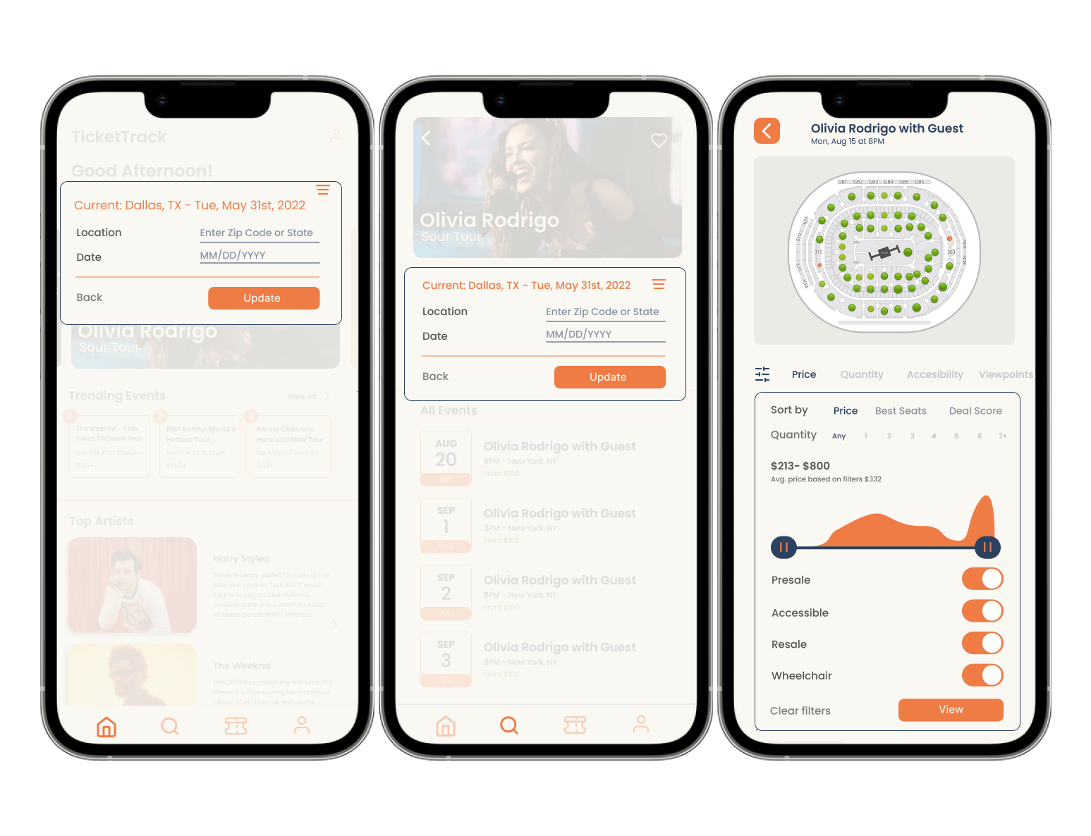
Filters - The wireframes and mockups just showed filters for seats but I also wanted to add a filter for the location and timezone. From the homepage the app welcomes the user and from there they can change their location and what events they want to see.
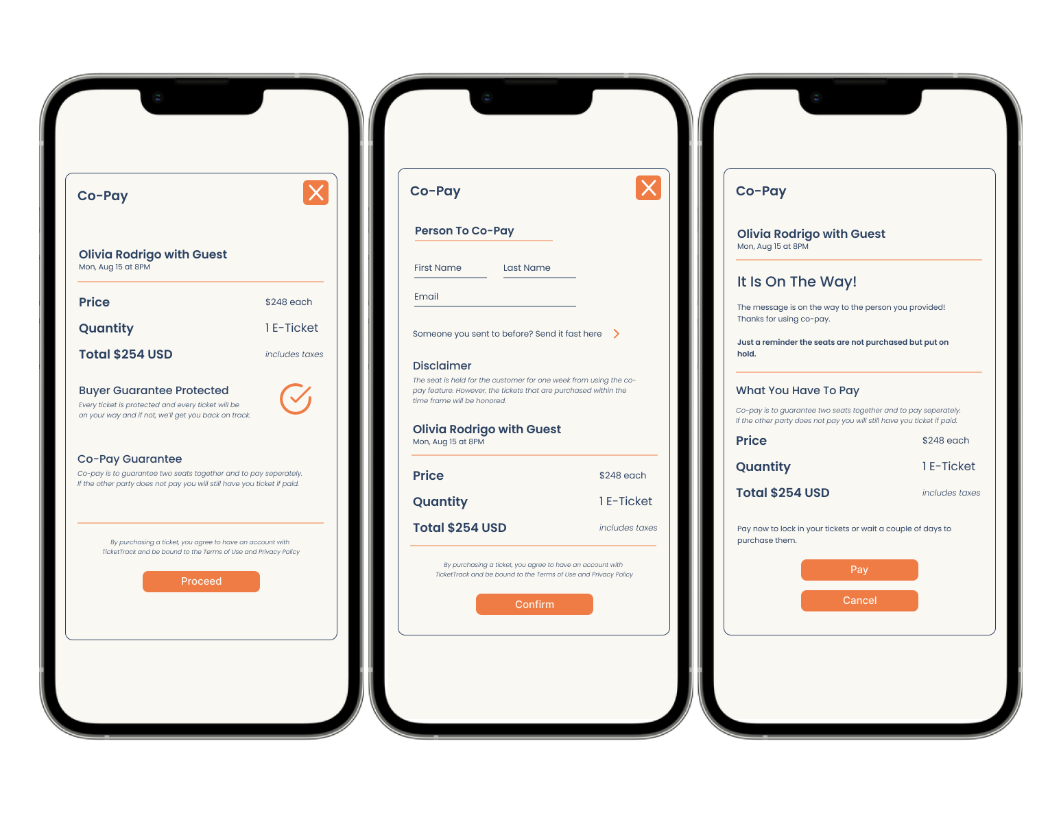
Checkout - From the beginning I found that the competitions checkout process was straight forwad and nothing of importance. With Co-Pay customers can hold their tickets and pay later or split the cost with someone else. This allows for customers to get their tickets but not have to front the cost right then and there.
HI-FIDELITY PROTOTYPE
The final high-fidelity prototype presents cleaner user flows for buying tickets. It also provides the customization, concise flow, transparency and filtering from the research conducted through user research.
TAKEAWAYS
While going through the process I learned that thinking about the user from the very beginning guides the design process. The product can look aesthetically pleasing but if it does not serve the user than what is the point of creating it at all. If I were to do it again I would focus more on the interaction between the user such as animation and more attention grabbing visuals.
Thank you for checking out my case study - steve :)